seaborn
![]()
Learning outcomes
At the end of this sessions, learners …
have practiced using the documentation of favorite HPC cluster
understand what
seabornisunderstand why
seabornis importanthave created a plot with
seaborn(optional) have created a plot with
seabornfrom apandastable
For teachers
Prior:
What is a plotting library?
Why would there be multiple plotting libraries?
What is seaborn?
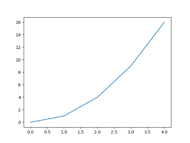
seaborn allows you to create figures:
import seaborn as sns
y = [0, 1, 4, 9, 16]
sns.lineplot(x = range(len(y)), y = y).figure.show()
Which shows:

Why is seaborn imported as sns?
From the seaborn FAQ:
This is an obscure reference to the namesake of the library, but you can also think of it as “seaborn name space”.
Why does this plot look identical to the matplotlib plot?
Because it is!
This plot is identical to the matplotlib plot in
the session about matplotlib,
because seaborn is built on top of matplotlib.
Hence, seaborn uses matplotlib for plotting.
Why seaborn is important
seaborn is one of the most popular Python plotting libraries.
It can be used to create publication-quality figures and
the seaborn plot gallery
shows that most plot types are present.
How popular is seaborn?
seaborn is not popular enough to be in
the PyPI top 20.
However, at
the seaborn PyPI statistics page
we see that it has around 20 million downloads per month.
As the number 20 package has around 800 million downloads per month,
we can infer that it is not all too unpopular.
Exercises
Want to see the answers as a video?
HPC cluster |
YouTube video |
|---|---|
Alvis |
|
COSMOS |
|
Dardel |
|
Kebnekaise |
|
Pelle |
|
Tetralith |
Exercise 1: a minimal seaborn program
Use the documentation of the HPC cluster you work on.
Answer: where is your documentation?
Sorted by HPC cluster:
HPC center |
HPC cluster |
HPC cluster-specific documentation |
|---|---|---|
C3SE |
Alvis |
|
UPPMAX |
Bianca |
|
LUNARC |
COSMOS |
|
PDC |
Dardel |
|
HPC2N |
Kebnekaise |
|
UPPMAX |
Pelle |
|
NSC |
Tetralith |
In that documentation, find the software module to load
the seaborn Python package.
Answer: where is the seaborn documentation?
HPC cluster |
HPC cluster-specific |
|---|---|
Alvis |
Has no documentation on how to load |
Bianca |
|
COSMOS |
Partially relevant |
Dardel |
Has no documentation on how to load |
Kebnekaise |
|
Pelle |
|
Tetralith |
Has no documentation on how to load |
In a terminal (on your HPC cluster), load the software module to use seaborn.
Answer: how to load the seaborn software module
HPC cluster |
How to load Seaborn |
|---|---|
Alvis |
|
COSMOS |
|
Dardel |
|
Kebnekaise |
|
Pelle |
|
Tetralith |
|
On your HPC cluster, create a script called seaborn_exercise_1.py
with the following code:
import seaborn
print(seaborn.__version__)
Run the script.
Answer: how to run the script
HPC cluster |
How to run the script |
|---|---|
Alvis |
|
COSMOS |
|
Dardel |
|
Kebnekaise |
|
Pelle |
|
Tetralith |
|
What do you see?
Answer: how does that look like?
The output looks similar to this:
0.13.2
Even though the code shows nothing directly useful, why is this a useful exercise anyways?
Answer
This is a useful exercise,
because it proves that you have successfully loaded/installed
seaborn.
Exercise 2: a minimal plot
On your HPC cluster,
create a script called seaborn_exercise_2.py,
with the following content:
import seaborn as sns
y = [0, 1, 4, 9, 16]
sns.lineplot(x = range(len(y)), y = y).figure.savefig("seaborn_exercise_2.png")
Run the script.
Answer: how to run the script
HPC cluster |
How to run the script |
|---|---|
Alvis |
|
COSMOS |
|
Dardel |
|
Kebnekaise |
|
Pelle |
|
Tetralith |
|
Check that the figure is created.
Answer: how to check that the figure is created
There are many ways to do so:
Download the file to your local computer: You can download the file to your local computer. Then use your favorite way to view this image.
View in a remote desktop environment: Your favorite HPC cluster has a remote desktop environment, which is a visual/graphical environment that is intuitive to use. There, for example, use the file explorer to find the file, then double-click it to do display it
View from a console environment that has X-forwarding enabled: Use the same procedure as on the ‘HPC Python’ course Day 1: view a plot.
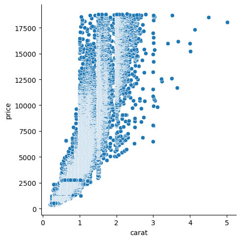
(optional) Exercise 3: displaying a pandas table
In this exercise, we will again use the ‘diamonds’ dataset (as a comma-separated file), click to download: a dataset about diamonds.
This dataset contains information about more than fifty thousand diamonds. Two such features are the weight (in carats) and the price (in USD). Here we want to use an image to display the relationship between these two.
On your HPC cluster,
create a script called seaborn_exercise_3.py. In that script:
Use
pandasto read the datasetUse
seabornto create a scatter plot from that data. Put the diamond weight on the x-axis and the diamond price on the y-axis. Use theseaborndocumentation, a search engine or an AI chatbot for the answer.save the plot as
seaborn_exercise_3.pngUse thematplotlibdocumentation, a search engine or an AI chatbot for the answer.
Answer
Here is a simple solution (simplified from this script):
import pandas as pd
import seaborn as sns
table = pd.read_csv("diamonds.csv")

scatter_plot = sns.relplot(
    data = table, x = "carat", y = "price"
)
scatter_plot.savefig("seaborn_exercise.png")
This will look like this:
(optional) Exercise 4: making the plot pretty
Use the seaborn documentation
to improve the plot, for example:
Add a title
Add titles to the axes
Add a linear trendline
Whatever you like