A Brief Introduction to the Seaborn Statistical Plotting Library
Seaborn is a plotting library built entirely with Matplotlib and designed to quickly and easily create presentation-ready statistical plots from Pandas data structures.
Seaborn can produce a wide variety of statistical plots, but in the interest of time, we will focus on a few that are especially hard to replicate with Matplotlib alone. We will use a couple of Seaborn’s built-in testing datasets, of which there are many.
Caution
Do NOT Rely on Seaborn for Regression Analysis!
Seaborn has a built-in regression function, but we will not cover it because Seaborn does not return any parameters needed to assess the quality of the fit. The official documentation itself warns that the Seaborn regression functions are only intended for quick and dirty visualizations to motivate proper in-depth analysis.
Load and Run Seaborn
Important
Interactive use (Recommended)
Go to the Open On-Demand web portal and start Jupyter Notebook (or VSCode) as described here in the Kebnekaise documentation and discussed on day 2 in the On-Demand lecture session. Available Spyder versions are old and generally not recommended.
Non-Interactive Use
To use Seaborn in a batch script, you can load
ml GCC/13.2.0 Seaborn/0.13.2
As usual, ml spider Seaborn shows the available versions and how to load them. These Seaborn modules are built to load their Matplotlib, Tkinter, and SciPy-bundle dependencies internally.
Important
Interactive Use (Recommended)
Start a Thinlinc session and open one of Spyder, Jupyter Lab, or VSCode from the On-Demand applications menu as discussed in the On-Demand lesson from Day 2. Spyder and Jupyter Lab are configured to load Seaborn and all its dependencies automatically via the latest version of Anaconda, whereas VSCode requires modules to be selected to load as part of the additional job settings.
Non-Interactive Use
To use Seaborn in a batch script, you can either load
ml GCC/13.2.0 Seaborn/0.13.2
if you prefer pip-installed Python packages, or you can load
ml Anaconda3/2024.06-1
if you have a conda environment or otherwise prefer Anaconda. As usual, ml spider Seaborn shows the available versions and how to load them.
Important
General Use
On Pelle, the only available Seaborn module right now is Seaborn/0.13.2-gfbf-2024a, and it can be loaded directly, as shown below:
module load Seaborn/0.13.2-gfbf-2024a
This command also loads SciPy-bundle/2024.05-gfbf-2024a (which includes Numpy and Pandas) and matplotlib/3.9.2-gfbf-2024a, but not any IDEs.
Interactive Use
In a Thinlinc session, open a terminal and start
interactive -A [project_name] -t HHH:MM:SS
as discussed in the interactive usage lesson on Day 2. Once transferred to a compute node, load Seaborn/0.13.2-gfbf-2024a and then load and run your preferred IDE following the IDEs lesson from Day 2.
Important
General Use
You should for this session load
module load buildtool-easybuild/4.8.0-hpce082752a2 GCC/13.2.0 Python/3.11.5 SciPy-bundle/2023.11
and then install seaborn to ~/.local/ if you don’t already have it.
pip install seaborn
Interactive Use
In a Thinlinc session, open a terminal and start
interactive -A [project_name] -t HHH:MM:SS
as discussed in the interactive usage lesson on Day 2. Once transferred to a compute node, do
module load buildtool-easybuild/4.8.0-hpce082752a2 GCC/13.2.0 Python/3.11.5 SciPy-bundle/2023.11 JupyterLab/4.2.0
or swap JupyterLab for your preferred IDE following the IDEs lesson from Day 2. Seaborn should not have to be loaded as a module since it would be installed in your home directory, which is always in $PATH.
Jupyter Lab is only available on Dardel via ThinLinc.
As there are only 30 ThinLinc licenses available at this time, we recommend that you work on the exercises with a local installation on a personal computer.
Do not trust that a ThinLinc session will be available or that On-Demand applications run therein will start in time for you to keep up (it is not unusual for wait times to be longer than the requested walltime).
The exercises were written to work on a regular laptop. If you must work on Dardel, follow the steps below. The exercise prompts and their solutions are included on this page.
Important
General Use
For this session, you could load
ml cray-python/3.11.7 PDCOLD/23.12 matplotlib/3.8.2-cpeGNU-23.12
On Dardel, all cray-python versions include NumPy, SciPy, Pandas, and Dask, and do not have any prerequisites, but Seaborn is part of matplotlib/3.8.2-cpeGNU-23.12, which has PDCOLD/23.12 as a prerequisite. The versions available for cray-python and Matplotlib are limited because Dardel users are typically expected to build their own environments, but for this course, the installed versions are fine.
Interactive use with Thinlinc (If Available) :collapsible:
Start Jupyter from the menu and it will work
Default Anaconda3 has all packages needed for this lesson
Or use Spyder:
First start interactive session
salloc --ntasks=4 -t 0:30:00 -p shared --qos=normal -A naiss2025-22-934
salloc: Pending job allocation 9102757
salloc: job 9102757 queued and waiting for resources
salloc: job 9102757 has been allocated resources
salloc: Granted job allocation 9102757
salloc: Waiting for resource configuration
salloc: Nodes nid001057 are ready for job
Then ssh to the specific node, like
ssh nid001057Use the conda env you created in Exercise 2 in Use isolated environments
ml PDC/24.11
ml miniconda3/25.3.1-1-cpeGNU-24.11
export CONDA_ENVS_PATH="/cfs/klemming/projects/supr/courses-fall-2025/$USER/"
export CONDA_PKG_DIRS="/cfs/klemming/projects/supr/courses-fall-2025/$USER/"
source activate spyder-env
# If needed, install the packages here by: "conda install matplotlib pandas seaborn"
spyder &
Important
For this session, you should use the Alvis portal: https://alvis.c3se.chalmers.se/public/root/
Log in
Ask for Desktop (Compute) in left-hand side menu. Do not choose “Jupyter”, since it gives you a TensorFlow environment with Python 3.8.
Open a Terminal and load the following software modules
ml Seaborn/0.13.2-gfbf-2024a
ml Jupyter-bundle/20250530-GCCcore-13.3.0
This will load matplotlib & SciPy-bundle on the fly!
Pandas, like NumPy, has typically been part of the SciPy-bundle module since 2020. Use
ml spider SciPy-bundleto see which versions are available and how to load them.Then start jupyter-lab and a web browser will automatically open
jupyter-lab
In all cases, once Seaborn or the module that provides it is loaded, it can be imported directly in Python. The typical abbreviation in online documentation is sns, but for those of us who never watched The West Wing, any sensible abbreviation will do. Here we use sb.
Attention
Remember: if you write Python scripts to be executed from the command line and you want any figures to open in a GUI window at runtime (as opposed to merely saving a figure to file), then your Python script will need to include matplotlib.use('Tkinter').
If you run these code snippets in Jupyter, you will need to include %% matplotlib inline
Common Features
Sample Datasets
This tutorial will make use of some of the free test data sets that Seaborn provides with the sb.load_dataset() function. These are also handy for playing with Pandas and a variety of machine learning packages (TensorFlow, PyTorch, etc.). The full list of datasets can be viewed with sb.get_dataset_names() (requires internet), and for more details, you can visit the GitHub repository and follow the links in the ReadMe under “Data Sources”. A few of the more popular data sets include…
'penguins', sex-segregated measurements of the beaks, flippers, and body masses of 3 species of penguins that live on the Antarctic Peninsula.'iris', measurements of the petal and sepal dimensions of three species of iris flower.'titanic', records of the ticket class, demographics, and survival status of passengers on the Titanic'mpg', information about the model, year, physical characteristics, engine specifications, and fuel economy of a variety of cars.'planets', a much older, smaller sample of the exoplanets data we used in the Pandas seminar, with fewer physical and orbital parameters. Hopefully it will be updated soon.
For most of this tutorial, we will use the 'mpg' dataset. For one of the exercises, you will use the ‘penguins’` dataset.
Commonalities in Plotting
Seaborn plotting functions are designed to take Pandas DataFrames (or sometimes Series) as inputs. As such, different plot types share many of the same kwargs (there are no mandatory positional args). The following are the most important:
data—the DataFrame in which to search for the remaining kwargs. You can pass it as either the first positional arg or as a kwarg, but it is mandatory either way.xandy—the names of two columns in your DataFrame to plot against each other. These are usually necessary, but not if you’re plotting every possible pairing of numerical data columns against each other all at once, as inpairplotorheatmap.hue—this kwarg accepts a categorical variable (e.g. species, sex, brand, etc.) column name, groups the data by those categories, and plots them all on the same plot in a different color.ax—this kwarg takes the name of an axis object if you want to add your Seaborn plot(s) as subplots on an existing figure.
“Figure vs. Axis-level interfaces.”
Whether you import matplotlib.pyplot and instantiate the usual fig, ax or not, Seaborn plotting commands look almost identical apart from the ax kwarg, which is only required if you want to add Seaborn subplots to other figures. If you use Seaborn plots with ax, they are essentially drop-in replacements for other Matplotlib axes methods, but you lose some of the nicer automatic formatting features, like exterior legends. Without the ax kwarg, a Seaborn plot will occupy a whole figure, which can make it trickier to format axes labels properly. A fuller explanation of the pros and cons of each approach is provided in the official documentation..
Caution
Seaborn typically titles axes by the variable names as they appear in the DataFrame, underscores and all. It’s easy enough to override the labels for a simple pairwise plot, but correcting the typesetting can get tedious and tricky when there are many subplots. An upcoming example will demonstrate one possible way to fix the axis label formatting.
Another common feature of Seaborn is that many of the high-level functions that you would ordinarily use are wrappers for more flexible base classes with methods that let you layer different plot types on top of each other. We only cover one case here, but keep in mind that if you need more customisation, check the documentation—almost everything is tunable.
Showing and Saving Figures
The easiest way to show and save figures produced with Seaborn is to import matplotlib.pyplot as plt and use the standard plt.show() and plt.savefig() commands. However, it is possible to get this functionality with Seaborn alone using the .figure accessor, though producing an interactive display can be very unintuitive when executing scripts directly from the command line.
Showing your figure
In an IDE, this is trivial: just assign your plotting command to a variable, and call
.figure.show()off of that variable name.- In a script to be executed from the command line, you may as well use
plt.show()because you typically still have to doimport matplotliband setmatplotlib.use('TkAgg')or another backend to make the display open. Moreover, whileplt.show()keeps the script from terminating until the user closes the graphic, for some reason.figure.show()does not, so the figure closes almost immediately after opening UNLESS you do one of the following: After the line containing
.figure.show(), add aninput()command, something likeinput("Press any key to exit").Run the script with the interactive
-ioption betweenpythonand the name of the script. Note that with this method, you will step into a Python shell after closing the figure.
- In a script to be executed from the command line, you may as well use
Saving your figure
This is easier: you can assign your plotting command to a variable, and call .figure.savefig(fname) off of that variable name. Since .figure.savefig() is just a wrapper for the pyplot method of the same name, all the args and kwargs are the same. The main difference is that there is no default filename, so you must at minimum pass a file name string or path as the first arg.
Plotting with Seaborn
Here we will explore a few of the plot types Seaborn offers that are difficult to replicate in Matplotlib:
sb.pairplot()(and the underlyingsb.PairGrid()function)sb.jointplot()(the bivariate special case of pair plot)sb.heatmap()andsb.clustermap()
In the interest of time, we will not go into box-and-whisker or violin plots, but be aware that compared to the Matplotlib implementations, the Seaborn versions of those plotting functions produce much nicer results with far less work.
Pairplot and PairGrid
When first starting analysis, it is often necessary to view bivariate distributions of many combinations of numeric variables.
For a typical dataset and typical display settings, it is enough to use Seaborn’s pairplot() function, a wrapper around the underlying, more customizable PairGrid(). Any categorical column not specified with hue is ignored automatically. If you need more flexibility in what is displayed on, above, and below the diagonal, see the Seaborn documentation on PairGrid.
Let’s use the 'mpg' dataset for demonstration. First, we need to see how many variables there are and whether any of them take a small number of discrete values. If there are more than about 5-6 numeric variables, a pairplot featuring all of them can become hard to read if constrained to the size of a journal page, so it’s best to plot only as many as necessary.
import seaborn as sb
mpg = sb.load_dataset('mpg')
print(mpg.info())
print(mpg.nunique())
<class 'pandas.DataFrame'>
RangeIndex: 398 entries, 0 to 397
Data columns (total 9 columns):
 #   Column        Non-Null Count  Dtype
---  ------        --------------  -----
 0   mpg           398 non-null    float64
 1   cylinders     398 non-null    int64
 2   displacement  398 non-null    float64
 3   horsepower    392 non-null    float64
 4   weight        398 non-null    int64
 5   acceleration  398 non-null    float64
 6   model_year    398 non-null    int64
 7   origin        398 non-null    str
 8   name          398 non-null    str
dtypes: float64(4), int64(3), str(2)
memory usage: 28.1 KB
None
mpg             129
cylinders         5
displacement     82
horsepower       93
weight          351
acceleration     95
model_year       13
origin            3
name            305
dtype: int64
Let’s drop ‘cylinders’, ‘model_year’, and ‘name’, and keep ‘origin’ for the hue. While we’re at it, let’s see what it would take just to give the axis labels proper capitalization and units.
import seaborn as sb
mpg = sb.load_dataset('mpg')
temp = mpg.drop(['model_year','cylinders', 'name'], axis='columns')
g = sb.pairplot(data=temp, corner=True, hue='origin')
### corner=True just turns off the redundant upper off-diagonal plots
### everything from here down is just fixing the axis labels
import string
for i in range(5):
    for j in range(5):
        try:
            xlabel = g.axes[i,j].xaxis.get_label_text()
            ylabel = g.axes[i,j].yaxis.get_label_text()
            if xlabel == 'mpg':
                g.axes[i,j].set_xlabel('Fuel Economy [mpg]')
            elif xlabel=='weight':
                g.axes[i,j].set_xlabel('Weight [lbs]')
            else:
                g.axes[i,j].set_xlabel(string.capwords(xlabel))

            if ylabel == 'mpg':
                g.axes[i,j].set_ylabel('Fuel Economy [mpg]')
            elif ylabel=='weight':
                g.axes[i,j].set_ylabel('Weight [lbs]')
            else:
                g.axes[i,j].set_ylabel(string.capwords(ylabel))
        except AttributeError:
            pass
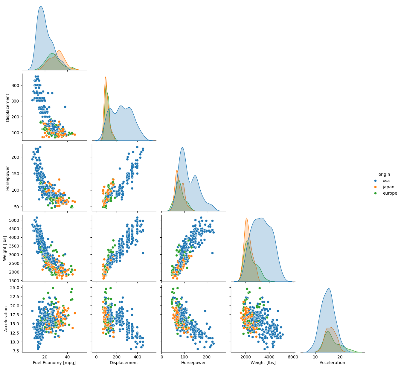
As you can see, most of the code was spent fixing the labels. The plot itself required only 1 line.
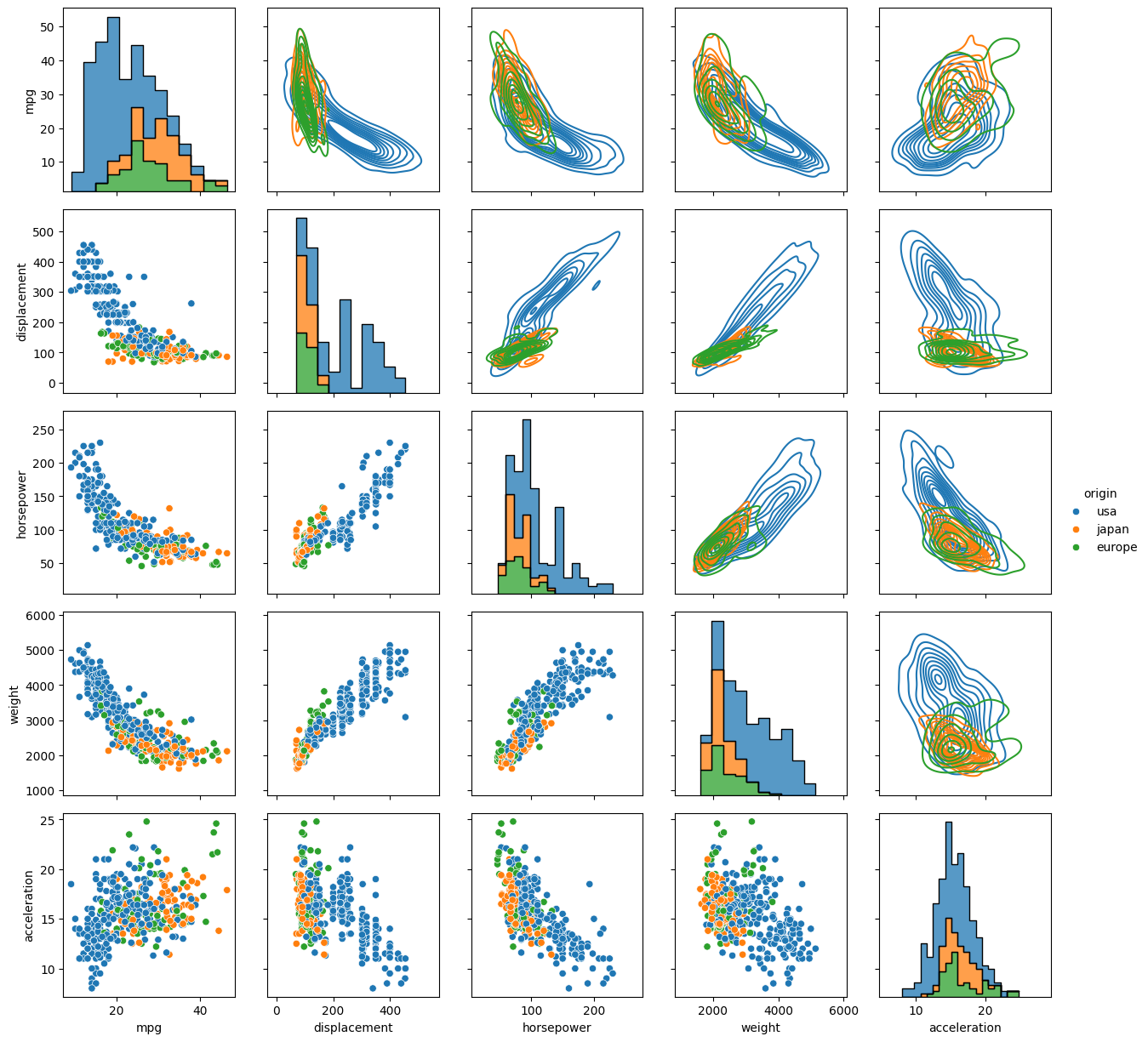
By default the off-diagonals are scatter plots, and the marginal distributions on the diagonal are either histograms if the data are not shaded by a categorical variable, or kernel density estimations (KDEs, basically histograms smoothed by convolution with a usually Gaussian kernel) if the hue kwarg is used. These options can be modified without resorting to PairGrid(), as detailed in the documentation.
Exercise
Load the dataset 'penguins' and make a pairplot where the data are colored by 'species'. You do not need to do anything to format the axis labels.
Solution
import seaborn as sb
from matplotlib import pyplot as plt
dat = sb.load_dataset('penguins')
g = sb.pairplot(data=dat, corner=True, hue='species')
plt.show()

Note
Unlike most other plots demonstrated here, pairplot() and PairGrid() do not have an ax kwarg because they are already plotting multiple subplots. They will and must occupy an entire figure.
Joint Plots
A joint plot is a special case of a pair plot with just 2 variables. The 1-line Seaborn .jointplot() command replaces roughly a dozen lines of pure Matplotlib commands. There is also an underlying, more tunable .JointGrid() function, similar to how .pairplot() wraps .PairGrid().
To demonstrate with the 'mpg' dataset, let’s plot the fuel economy in mpg against vehicle weight, and color the data by region of origin.
import seaborn as sb
mpg = sb.load_dataset('mpg')
jp = sb.jointplot(data=mpg, x='weight', y='mpg', hue='origin', marginal_ticks=True)
#fix the labels to make them presentable
from matplotlib import pyplot as plt
plt.xlabel('Weight [lbs]')
plt.ylabel('Fuel Economy [mpg]')
plt.show()
By default the main plot is a scatter plot, and the marginal plots are either histograms if the data are not shaded by a categorical variable, or KDEs if the hue kwarg is used. The type of central plot can be changed with the kind kwarg, (see `the documentation on joint plots for options and other kwargs <https://seaborn.pydata.org/generated/seaborn.jointplot.html>__). Some options change the appearance of the marginal distributions.
Heatmap and Clustermap
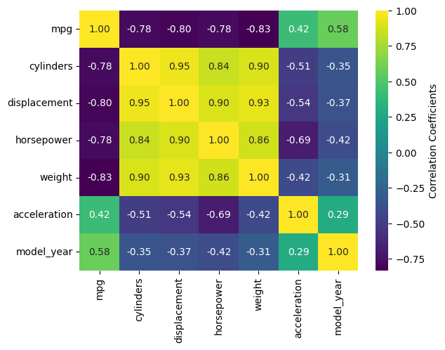
Sometimes you have too many variables to look at with pair plots/corner plots, and the best you can do is map the correlation coefficients between different parameters. Alternatively, you might have a DataFrame with a comparable number of numeric rows and columns, and you want to see how the rows and columns correlate. Either way, the DataFrame must be able to be coerced to ndarray.
Once again, making this type of plot is extremely tedious in pure Matplotlib, but can require as little as one line of code with Seaborn. There are two functions that do this: sb.heatmap() and sb.clustermap(). The main difference between the two is that clustermap() attempts to rearrange variables so those that are correlated are positioned next to each other and connected by a tree diagram.
The mpg DataFrame can’t be used directly, but the correlation matrix of it can be. Fortunately, .corr() is a DataFrame method. Let’s see what heatmap() looks like for the numeric columns of mpg.
import seaborn as sb
mpg = sb.load_dataset('mpg')
sb.heatmap(mpg.corr(numeric_only=True), annot=True, fmt=".2f", cbar_kws={'label':'Correlation Coefficients'})
<Axes: >
Exercise
Reformat the code above to run on your own system in your choice of interface, but use clustermap instead of heatmap.
Solution
import seaborn as sb
mpg = sb.load_dataset('mpg')
sb.clustermap(mpg.corr(numeric_only=True), annot=True, fmt=".2f", cbar_kws={'label':'Correlation Coefficients'})
<seaborn.matrix.ClusterGrid at 0x7f63f76fbd70>
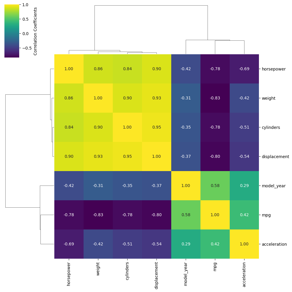
The most handy kwargs for these two functions is annot, which prints the values of the squares is True or accepts an alternative annotation array, and cbar_kws, which accepts formatting kwargs for Matplotlib’s fig.colorbar() as a dictionary. Also shown are fmt, which tells annot how to render the numbers and uses the same form as the expressions in the curly braces of {:}.format() after the colon. For other kwargs, see the heatmap() documentation here.
Warning
There is a bug in Seaborn/0.12.2 that causes heatmap() and clustermap() with annot=True to only label the top row. This is fixed in later versions.
Keypoints
Seaborn makes statistical plots easy and good-looking!
Seaborn plotting functions take in a Pandas DataFrame, sometimes the names of variables in the DataFrame to extract as
xandy, and often ahuethat makes different subsets of the data appear in different colors depending on the value of the given categorical variable.Seaborn also offers datasets to play with.
Typesetting axes labels can be tedious, though.
Saving and showing figures are best done with the standard
pyplotfunctions.