A Brief Intro to Matplotlib
Matplotlib is one of the most popular and flexible function libraries for data visualization in use today. This crash course is meant to summarize and compliment the official documentation, but you are encouraged to refer to the original documentation for fuller explanations of function arguments.
Prerequisites
In order to follow this course, you will need to be familiar with:
The Python 3.X language, data structures (e.g. dictionaries), and built-in functions (e.g. string manipulation functions)
NumPy: array I/O and manipulation
It will also help to have experience with:
SciPy
Pandas
LaTeX math typesetting (reference links are provided)
You should be familiar with the meanings of the terms args and kwargs, since they will appear frequently:
argsrefer to positional arguments, which are usually mandatory, but not always. These always come before thekwargs.kwargsare short for keyword arguments. These are usually optional, but it’s fairly common for some python functions to require a variable subset of all available kwargs dependent on previous inputs. These always come afterargs.
Load and Run
In most cases, you will need to load a compatible version of SciPy-bundle to use NumPy, which you will need to create or prepare data for plotting.
from matplotlib import pyplot as plt
In all cases, once you have reached the stage where you are at a Python command prompt or in a script file, the first thing you will have to do to use any plotting commands is import matplotlib.pyplot. Usually the command is written as it is in the title of this info box, but you can also just write import matplotlib.pyplot as plt for short. If you work in a development environment like Spyder, that will often be the only package that you need out of Matplotlib.
If you use Matplotlib at the command line, you will need to load the module Tkinter and then, after importing matplotlib, set matplotlib.use('TkAgg') in your script or at the Python prompt in order to view your plots.
Alternatively, you can use a GUI, either JupyterLab or Spyder, but you will still have to pre-load Matplotlib and any other modules you want to use (if you forget any, you’ll have to close the GUI and reopen it after loading the missing modules) before loading either of them. The command to start Jupyter Lab after you load it is jupyter-lab, and the Spyder launch command is spyder3. The only version of Spyder available is pretty old, but the backend should work as-is.
As of 27-11-2024, ml spider matplotlib outputs the following versions:
----------------------------------------------------------------------------
  matplotlib:
----------------------------------------------------------------------------
     Versions:
        matplotlib/2.2.4-Python-2.7.15
        matplotlib/2.2.4-Python-2.7.16
        matplotlib/2.2.4 (E)
        matplotlib/2.2.5-Python-2.7.18
        matplotlib/2.2.5 (E)
        matplotlib/3.1.1-Python-3.7.4
        matplotlib/3.1.1 (E)
        matplotlib/3.2.1-Python-3.8.2
        matplotlib/3.2.1 (E)
        matplotlib/3.3.3
        matplotlib/3.3.3 (E)
        matplotlib/3.4.2
        matplotlib/3.4.2 (E)
        matplotlib/3.4.3
        matplotlib/3.4.3 (E)
        matplotlib/3.5.2-Python-3.8.6
        matplotlib/3.5.2
        matplotlib/3.5.2 (E)
        matplotlib/3.7.0
        matplotlib/3.7.0 (E)
        matplotlib/3.7.2
        matplotlib/3.7.2 (E)
        matplotlib/3.8.2
        matplotlib/3.8.2 (E)

Names marked by a trailing (E) are extensions provided by another module.
On COSMOS, it is recommended that you use the On-Demand Spyder or Jupyter applications to use Matplotlib. Some Matplotlib scripts will be demonstrated on Cosmos with Spyder.
If you must work on the command line, then you will need to load matplotlib separately, along with all the prerequisite modules (don’t forget the SciPy-bundle if you plan to use NumPy, SciPy, or Pandas!). The module Tkinter loads as a dependency of Matplotlib, but after importing matplotlib, you still need to set matplotlib.use('TkAgg') in your script or at the Python prompt in order to view your plots.
As of 27-11-2024, ml spider matplotlib outputs the following versions:
----------------------------------------------------------------------------
  matplotlib:
----------------------------------------------------------------------------
    Description:
      matplotlib is a python 2D plotting library which produces publication
      quality figures in a variety of hardcopy formats and interactive
      environments across platforms. matplotlib can be used in python
      scripts, the python and ipython shell, web application servers, and
      six graphical user interface toolkits.

     Versions:
        matplotlib/2.2.5-Python-2.7.18
        matplotlib/3.3.3
        matplotlib/3.4.2
        matplotlib/3.4.3
        matplotlib/3.5.2
        matplotlib/3.7.0
        matplotlib/3.7.2
        matplotlib/3.8.2
        matplotlib/3.9.2

----------------------------------------------------------------------------
There is a bug in matplotlib/3.9.2, so for now that version should be avoided.
On Rackham, loading Python version 3.8.7 or newer will allow you to import Matplotlib and NumPy without having to load anything else. If you wish to also import Jupyter, Pandas, and/or Seaborn, those and Matplotlib are also provided all together by python_ML_packages. The output of module spider python_ML_packages is
----------------------------------------------------------------------------
  python_ML_packages:
----------------------------------------------------------------------------
     Versions:
        python_ML_packages/3.9.5-cpu
        python_ML_packages/3.9.5-gpu
        python_ML_packages/3.11.8-cpu

----------------------------------------------------------------------------
  For detailed information about a specific "python_ML_packages" package (includ
ing how to load the modules) use the module's full name.
  Note that names that have a trailing (E) are extensions provided by other modu
les.
  For example:

     $ module spider python_ML_packages/3.11.8-cpu
----------------------------------------------------------------------------
We recommend the latest version, python_ML_packages/3.11.8-cpu
For versions earlier than Python 3.8.x, module spider matplotlib outputs the following:
----------------------------------------------------------------------------
  matplotlib:
----------------------------------------------------------------------------
    Description:
      matplotlib is a python 2D plotting library which produces publication
      quality figures in a variety of hardcopy formats and interactive
      environments across platforms. matplotlib can be used in python
      scripts, the python and ipython shell, web application servers, and
      six graphical user interface toolkits.

     Versions:
        matplotlib/2.2.3-fosscuda-2018b-Python-2.7.15
        matplotlib/3.0.0-intel-2018b-Python-3.6.6
        matplotlib/3.0.3-foss-2019a-Python-3.7.2
        matplotlib/3.3.3-foss-2020b
        matplotlib/3.3.3-fosscuda-2020b
        matplotlib/3.4.3-foss-2021b
The native backend should work if you are logged in via Thinlinc, but if there is a problem, try setting matplotlib.use('Qt5Agg') in your script. You’ll need X-forwarding to view any graphics via SSH, and that may be prohibitively slow.
Matplotlib on Tetralith depends not just on GCC, but on buildtool-easybuild/4.X.X-hpcXXXXXXXXX where the X’s are alphanumeric. Loading it also does not load Python or any of its other packages automatically, so you will need to either pick a Matplotlib version and check ml avail Python for which Python and SciPy-bundle versions to load with it, or, choose your preferred Python and/or SciPy-bundle version(s) and see which if any Matplotlib modules are made available.
As of 15-04-2025, ml spider matplotlib outputs the following:
----------------------------------------------------------------------------
  matplotlib:
----------------------------------------------------------------------------
    Description:
      matplotlib is a python 2D plotting library which produces publication
      quality figures in a variety of hardcopy formats and interactive
      environments across platforms. matplotlib can be used in python
      scripts, the python and ipython shell, web application servers, and
      six graphical user interface toolkits.

     Versions:
        matplotlib/3.5.2
        matplotlib/3.8.2

----------------------------------------------------------------------------
  For detailed information about a specific "matplotlib" package (including how to load the modules) use the module's full name.
  Note that names that have a trailing (E) are extensions provided by other modules.
  For example:

     $ module spider matplotlib/3.8.2
----------------------------------------------------------------------------
The module Tkinter loads as a dependency of Matplotlib, but after importing matplotlib, you still need to set matplotlib.use('TkAgg') in your script or at the Python prompt in order to view your plots, and call plot.show() explicitly to make the display window appear.
We will be using Python/3.11.5, which works with matplotlib/3.8.2.
If you want to use Jupyter in this session the easiest way is this:
module load buildtool-easybuild/4.8.0-hpce082752a2 GCC/13.2.0 Python/3.11.5 SciPy-bundle/2023.11 JupyterLab/4.2.0
Due to the limited number of Thinlinc licenses, it is assumed that you will be using SSH with X-forwarding.
Note that at PDC, almost all modules require you to load a module starting with PDC (e.g. PDC/23.12, PDCOLD/XX.XX, PDCTEST/XX.XX) before loading anything else.
Also, unlike at other centers, if you load the wrong module you should either only use the
ml unload <module>command, or save a module collection to restore after usingml purge, because 13 modules are loaded when you first log in and only one of them is sticky (i.e. not removed by an ordinary purge command).
Dardel documentation generally assumes that you will need to build your own environment with conda or pip because the options available natively are fairly limited.
As of 15-04-2025, ml spider matplotlib outputs the following:
----------------------------------------------------------------------------
  matplotlib:
----------------------------------------------------------------------------
     Versions:
        matplotlib/3.8.2-cpeGNU-23.12
        matplotlib/3.8.2 (E)
     Other possible modules matches:
        py-matplotlib

Names marked by a trailing (E) are extensions provided by another module.
The output is misleading in that matplotlib/3.8.2-cpeGNU-23.12 is the module that provides matplotlib/3.8.2 as an extension, so there is really only that one option. This version requires Python 3.11.x, which on Dardel is best provided by cray-python/3.11.5 and cray-python/3.11.7 (both of which include NumPy, SciPy, and mpi4py). This matplotlib version also requires preloading PDC/23.12.
After importing matplotlib, you will need to set matplotlib.use('TkAgg') in your script or at the Python prompt in order to view your plots, and call plot.show() explicitly to make the display window appear.
Controlling the Display
At the regular terminal, Matplotlib figures will typically not display unless you a set backend that allows displays and is compatible with your version of python (The exception to this is Rackham, which should run without you having to set a backend). Backends are engines for either displaying figures or writing them to image files (see the matplotlib docs page on backends for more detail for more info).
Command Line. For Python 3.11.x, a Tkinter-based backend is required to generate figure popups when you type plt.show() at the command line. You can set the appropriate backend by importing the top-level matplotlib package and then running matplotlib.use('TkAgg') before doing any plotting (if you forget, you can set it at any time). If for some reason that doesn’t work, or if you’re on Rackham and the default backend doesn’t work for you, you can try matplotlib.use('Qt5Agg').
Jupyter. In Jupyter, after importing matplotlib or any of its sub-modules, you typically need to add % matplotlib inline before you make any plots. You should not need to set matplotlib.use().
Spyder. In Spyder, the default setting is for figures to be displayed in-line at the IPython console or in a “Graphics” tab in the upper right. In either case, the graphic will be too small and not the best use of the resources Spyder makes available. To make figures appear in an interactive popup, go to “Preferences”, then “IPython console”, click the “Graphics” tab, and switch the Backend from “Inline” to “Automatic” the provided drop-down menu. These settings should be retained from session to session, so you only have to do it the first time you run Spyder. The interactive popup for Spyder offers extensive editing and saving options.
Matplotlib uses a default resolution of 100 dpi and a default figure size of 6.4” x 4.8” (16.26 x 12.19 cm) in GUIs and with the default backend. The inline backend in Jupyter (what the % matplotlib inline command sets) uses an even lower-res default of 80 dpi.
The
dpikwarg inplt.figure()orplt.subplots()(not a valid kwarg inplt.subplot()singular) lets you change the figure resolution at runtime. For on-screen display, 100-150 dpi is fine as long as you don’t setfigsizetoo big, but publications often request 300 DPI.The
figsize = (i,j)kwarg inplt.figure()andplt.subplots()also lets you adjust the figure size and aspect ratio. The default unit is inches.
Follow the preceding sections to get to the stage of importing matplotlib.pyplot and numpy in your choice of interface, on your local computing resource.
Basic Terms and Application Programming Interface (API)
The Matplotlib documentation has a nicely standardized vocabulary for the different components of its output graphics. For all but the simplest plots, you will need to know what the different components are called and what they do so that you know how to access and manipulate them.
Figure: the first thing you do when you create a plot is make a
Figureinstance. It’s essentially the canvas, and it contains all other components.Axes: most plots have 1 or more sets of
Axes, which are the grids on which the plots are drawn, plus all text that labels the axes and their increments.Axis: each individual axis is its own object. This lets you control the labels, increments, scaling, text format, and more.
Artist: In Python, almost everything is an object. In Matplotlib, the figure and everything on it are objects, and every object is an
Artist–every axis, every data set, every annotation, every legend, etc. This word typically only comes up in the context of functions that create more complicated plot elements, like polygons or color bars.
For everything else on a typical plot, there’s this handy graphic:

fig? ax? What are those?
There are 2 choices of application programming interface (API, basically a standardized coding style) in Matplotlib:
Implicit API: the quick and dirty way to visualize isolated data sets if you don’t need to fiddle with the formatting.
Explicit API (recommended): the method that gives you handles to the figure and axes objects (typically denoted
figandax/axes, respectively) so you can adjust the formatting and/or accommodate multiple subplots.
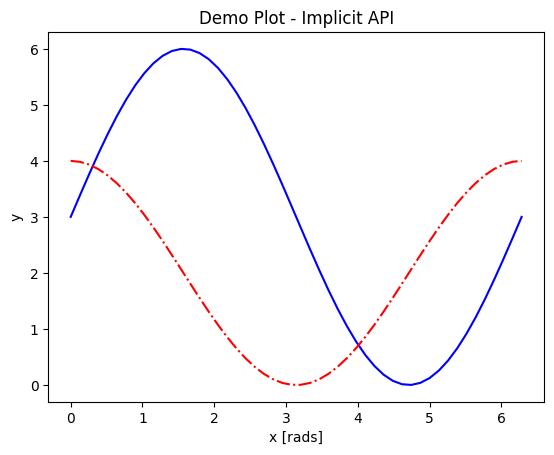
Most people’s first attempt to plot something in matplotlib looks like the following example of the implicit API. The user simply imports matplotlib.pyplot (usually as plt) and then plugs their data into their choice of plotting function, plt.<function>(*args,**kwargs).
import numpy as np
import matplotlib.pyplot as plt
# this code block uses Jupyter to execute
%matplotlib inline
x = np.linspace(0,2*np.pi, 50)   # fake some data
# Minimum working example with 2 functions
plt.plot(x,3+3*np.sin(x),'b-',
         x, 2+2*np.cos(x), 'r-.')
plt.xlabel('x [rads]')
plt.ylabel('y')
plt.title('Demo Plot - Implicit API')
plt.show()
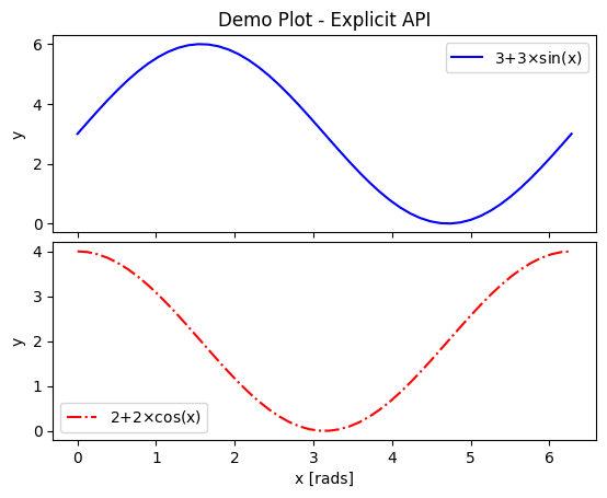
The explicit API looks more like the following example. A figure and a set of axes objects are created explicitly, usually with fig,axes = plt.subplots(nrows=nrows, ncols=ncols), even if there will be only 1 set of axes (in which case the nrows and ncols kwargs are omitted). Then the vast majority of the plotting and formatting commands are called as methods of the axes object. Notice that most of the formatting methods now start with set_ when called upon an axes object.
import numpy as np
import matplotlib.pyplot as plt
# this code block uses Jupyter to execute
%matplotlib inline
x = np.linspace(0,2*np.pi, 50)
# Better way for later formatting
fig, ax = plt.subplots()
ax.plot(x,3+3*np.sin(x),'b-')
ax.plot(x, 2+2*np.cos(x), 'r-.')
ax.set_xlabel('x [rads]')
ax.set_ylabel('y')
ax.set_title('Demo Plot - Explicit API')
plt.show()

The outputs look the same above because the example was chosen to work with both APIs, but there is a lot that can be done with the explicit API but not the implicit API. A prime example is using the subplots function for its main purpose, which is to support and format 2 or more separate sets of axes on the same figure.
Let x be an array of 50 values from -5 to 5. Plot y = 1/(1+exp(-x)).
Solution
The code block below uses Jupyter to render the output, which requires
%matplotlib inline. If you’re at the command line, you would have had to import matplotlib and setmatplotlib.use('TkAgg')or the recommended backend from the section on controlling the display. You did not have to choose a format string.import numpy as np import matplotlib.pyplot as plt %matplotlib inline x = np.linspace(-5,5, 50) fig, ax = plt.subplots() ax.plot(x, 1/(1+np.exp(-x))) plt.show()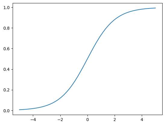
Subplots and Subplot Mosaics
For the standard plt.subplots(nrows=nrows, ncols=ncols) command, the shape of axes will be
2D if both
nrowsandncolsare given,1D if either
nrowsorncolsare provided but not both, or0D (not iterable) if neither are given.
import numpy as np
import matplotlib.pyplot as plt
%matplotlib inline
x = np.linspace(0,2*np.pi, 50)
fig, axes = plt.subplots(nrows=2,  sharex=True)
fig.subplots_adjust(hspace=0.05) #reduces space between 2 plots
axes[0].plot(x,3+3*np.sin(x),'b-', label=r'3+3$\times$sin(x)')
axes[1].plot(x, 2+2*np.cos(x), 'r-.', label=r'2+2$\times$cos(x)')
axes[1].set_xlabel('x [rads]')
for ax in axes:
    ax.legend()
    ax.set_ylabel('y')
axes[0].set_title('Demo Plot - Explicit API')
plt.show()
There are also the plt.subplot() and fig.add_subplot() methods, but they require more code to put >1 plot on a single figure. Each plot much be added 1 at a time, and there can be no more than 9 plots on one figure. The main benefit of these alternatives is that different coordinate projections can be set for each subplot in a figure with multiple subplots, as the example below demonstrates.
import numpy as np
import matplotlib.pyplot as plt
%matplotlib inline
x = np.linspace(0,2*np.pi, 50)
# for variable projections
fig = plt.figure(figsize=(8,4))
ax1 = plt.subplot(121)
#once labels are added, have to break up plt.plot()
#  args cannot follow kwargs
ax1.plot(x,3+3*np.sin(x),'b-', label=r'3+3$\times$sin(x)')
ax1.plot(x, 2+2*np.cos(x), 'r-.', label=r'2+2$\times$cos(x)')
ax1.set_xlabel('x [rads]')
ax1.set_ylabel('y')
ax1.legend()
ax1.set_title('a) Cartesian projection (default)')
ax2 = plt.subplot(122, projection='polar')
ax2.plot(x, 3+3*np.sin(x), 'b-', x, 2+2*np.cos(x), 'r-.')
ax2.set_title('b) Polar projection')
fig.suptitle('Demo Plots')
plt.show()
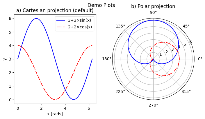
The 3-digit number in parentheses gives the position of that set of axes on the subplot grid: the first digit is the total number of panels in a row, the second digit gives the number of plots in a column, and the last digit is the 1-based index of that plot as it would appear in a flattened ordered list. E.g. if a subplot grid had 2 rows and 3 columns, the top row would be indexed [1,2,3], and the bottom row would be indexed [4,5,6].
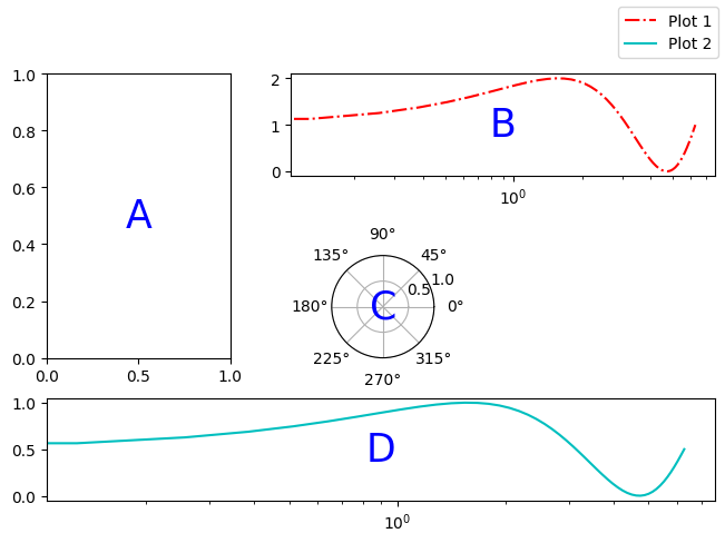
The final alternative is plt.subplot_mosaic(), which allows one to easily set subplots to span multiple rows or columns.
Each plot is identified by a single ASCII character (any alphanumeric character) in a string. Multiple occurrences of the same character are used to indicate where that plot spans multiple rows or columns.
The character
.is used to denote gaps.The character sequence can be intuitive like in the example below, where each row on the grid is on a separate line, but you can also separate rows with
;for more compact code (no spaces!).There is a
per_subplot_kw, which accepts a nested dictionary where the single-character plot labels are keys, and the values are themselves dictionaries with axes methods or kwargs ofplt.subplot()as keys and their inputs as values. These are useful if you need to, for example, specify a different axis projection for each plot.
import numpy as np
import matplotlib.pyplot as plt
%matplotlib inline
x = np.linspace(0,2*np.pi, 50)
fig, axd = plt.subplot_mosaic(
    """
    ABB
    AC.
    DDD
    """, layout="constrained",
    per_subplot_kw={"C": {"projection": "polar"},
                   ('B','D'): {'xscale':'log'}})
for k, ax in axd.items():
    ax.text(0.5, 0.5, k, transform=ax.transAxes,
            ha="center", va="center",  color="b",
            fontsize=25)
axd['B'].plot(x, 1+np.sin(x), 'r-.',
              label='Plot 1')
axd['D'].plot(x,0.5+0.5*np.sin(x), 'c-',
              label='Plot 2')
fig.legend(loc='outside upper right')
<matplotlib.legend.Legend at 0x7fc59473e6f0>
The above demo also includes an example of how to add text to a plot. More on that later.
Saving your Data
The Matplotlib GUI has a typical save menu option (indicated by the usual floppy disc icon) that lets you set the name, file type, and location. To save from your code or at the command line, there are 2 options:
plt.savefig(fname, *, transparent=None, dpi='figure', format=None)is the general-purpose save function. There are other kwargs not shown here, but these are the most important. The file type can be givenformator inferred from an extension given infname. The defaultdpiis inherited fromplt.figure()orplt.subplots(). Iftransparent=True, the white background of a typical figure is removed so the figure can be displayed on top of other content.plt.imsave(fname, arr, **kwargs)is specifically for saving arrays to images. It accepts a 2D (single-channel) array with a specified colormap and normalization, or an RGB(A) array (a stack of images in 3 color channels, or 3 color channels and an opacity array). Generally you also have to setorigin='lower'for the image to be rendered right-side up.
A few common formats that Matplotlib supports include PDF, PS, EPS, PNG, and JPG/JPEG. Other desirable formats like TIFF and SVG are not supported natively in interactive display backends, but can be used with static backends (used for saving figures without displaying them) or with the installation of the Pillow module. At most facilities, Pillow is loaded with Matplotlib, so you will see SVG as a save option in the GUI. Matplotlib has a tutorial here on importing images into arrays for use with pyplot.imshow().
Rerun your earlier example and save it as an SVG file if the option is available, PDF otherwise.
Standard Available Plot Types
These are the categories of plots that come standard with any Matplotlib distribution:
Pairwise plots (which accept 1D arrays of x and y data to plot against each other),
Statistical plots (which can be pairwise or other array-like data),
Gridded data plots (for image-like data, vector fields, and contours),
Irregularly gridded data plots (which rely on some kind of triangulation)*, and
Volumetric data plots.
* Quick note on contouring functions on irregular grids: these functions contour by the values Z at triangulation vertices (X,Y), not by spatial point density, and so should not be used if Z values are not spatially correlated. If you want to contour by data point density in parameter-space, you still have to interpolate your data to a regular (X,Y) grid.
Volumetric, polar, and other data that rely on 3D or non-cartesian grids typically require you to specify a projection before you can choose the right plot type. For example, for a polar plot, you could
set
fig, ax = plt.subplots(subplot_kw = {"projection": "polar"})to set all subplots to the same projection,set
ax = plt.subplot(nrows, ncols, index, projection='polar')to add one polar subplot to a group of subplots with different coordinate systems or projections, orset
ax = plt.figure().add_subplot(projection='polar')if you only need 1 set of axes in total.
For volumetric data, the options are similar:
fig, ax = plt.subplots(subplot_kw = {"projection": "3d"})for multiple subplots with the same projection,ax = plt.subplot(nrows, ncols, index, projection='3d')for one 3D subplot among several with varying projections or coordinate systems, orax = plt.figure().add_subplot(projection='3d')for a singular plot.
Colors and colormaps. Every plotting method accepts either a single color (the kwarg for which may be c or color) or a colormap (which is usually cmap in kwargs). Matplotlib has an excellent series of pages on how to specify colors and transparency, how to adjust colormap normalizations, and which colormaps to choose based on the types of data and your audience.
Formatting and Placing Plot Elements
Placing Legends and Text
Text. There are 2 functions for adding text to plots at arbitrary points: .annotate() and .text()
.text()is base function; it only adds and formats text (e.g.haandvaset horizontal and vertical alignment).annotate()adds kwargs to format connectors between points and text; coordinates for point and text are specified separately
Positions for both are given in data coordinates unless one includes transform=ax.transAxes. ax.transAxes switches from data coordinates to axes-relative coordinates where (0,0) is lower left corner of the axes object, (1,1) is the top right corner of the axes, and values <0 or >1 are outside of the axes (figure area will stretch to accommodate up to a point).
Legends. Typically, it’s enough to just use plt.legend() or ax.legend() if you want to label multiple functions on the same plot.
Legends can be placed with the
lockwarg according to a number from 0 to 10, or with a descriptive string like'upper left'or'lower center'. In the number code system, 0 (default) tells matplotlib to just try to minimize overlap with data, and the remaining digits represent ninths of the axes area (“center right” is duplicated for some reason).You can also arrange the legend entries in multiple columns by setting the
ncolskwarg to an integer greater than 1, which can help if space is more limited vertically than horizontally.Legend placement via
bbox_to_anchoruses unit-axes coordinates (i.e. the same coordinates described above astransform=ax.transAxes) by default, and can specify any coordinates on or off the plot area (x and y are within the plot area if they are between 0 and 1, and outside otherwise).Whole-figure legends (i.e.
fig.legend()) can use a 3-word string where the first word is “outside”, likeloc='outside center right'.
Mathtext
Most journals expect that you typeset all variables and math scripts so they appear the same in your plots main text. Matplotlib now supports most LaTeX math commands, but you need to know some basic LaTeX syntax, some of which is covered in that link. For more information, you can refer to the WikiBooks documentation on LaTeX math, starting with the Symbols section.
LaTeX may need to be installed separately for Matplotlib versions earlier than 3.7, or for exceptionally obscure symbols or odd-sized delimiters.
Unfortunately, Python and LaTeX both use curly braces ({}) as parts of different functions, so some awkward adjustments had to be made to resolve the collision.
In
str.format(), all curly braces ({}) associated with LaTeX commands must be doubled ({{}}), including nested braces. An odd-numbered set of nested curly brace pairs will be interpreted as a site for string insertion.Many characters also require the whole string to have an
r(for raw input) in front of the first single- or double-quote, like \(\times\) (rendered as'$\times$'), \(\pm\) or \(\mp\)(rendered as'$\pm$'and'$\mp$'respectively), or most Greek letters.Most basic operator symbols (+, -, /, >, <, !, :, |, [], ()) can be used as-is, but some that have functional meanings in LaTeX, Python, or both (e.g. $ and %) must be preceded by a single- (LaTeX command symbols only) or double-backslash (\\) to escape their typical usage.
Spaces within any character sequence between two
$s are not rendered; they only exist to separate alphabetic characters from commands. You can insert a space with\;if you don’t want to split up the LaTeX sequence to add spaces.
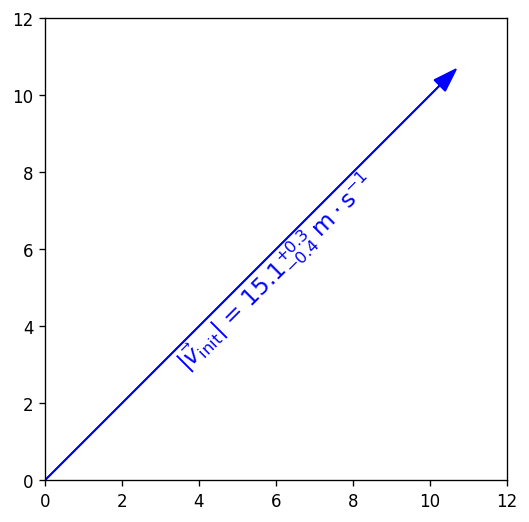
You can use string insertion inside of formatting operators like the super- and subscript commands, but it can require a lot of sequential curly braces. The following is an example demonstrating some tricky typesetting. Note that you generally cannot split the string text over multiple lines because the backslash has other essential uses to the typesetting.
import numpy as np
import matplotlib.pyplot as plt
%matplotlib inline
v_init=15.1
error_arr=[-0.4,0.3]
fig,ax=plt.subplots(dpi=120,figsize=(5,5))
ax.set_aspect('equal') #arrowheads will slant if axes are not equal
ax.arrow(0,0,10.68,10.68,length_includes_head=True,color='b',
         head_width=0.4)
ax.text(6, 5.4, r"$|\vec{{v}}_{{\mathrm{{init}}}}|$ = ${:.1f}_{{{:.1}}}^{{+{:.1}}}\;\mathrm{{m\cdot s}}^{{-1}}$".format(v_init,*error_arr),
        ha='center',va='center',rotation=45.,size=14, color='b')
ax.set_xlim(0,12)
ax.set_ylim(0,12)
plt.show()
Formatting Axes
Axes objects (the ax in fig,ax=plt.subplots()) have dozens of methods and attributes apart from the function methods covered in the Standard Available Plot Types section. Most of the methods that are plotting functions are for formatting and labeling the axes. Among the most commonly used, some of which you’ve already seen, are:
ax.set_xlabel(str)andax.set_ylabel(str), which add titles to the axes, as was already shown.ax.set_title(str)adds a title to the top of the plotax.legend()adds a box with the names and markers of each function or data set on a plotax.grid()adds grid lines at the locations of major axes ticksax.set_xlim()andax.set_ylim(), which change the lower and upper bounds of the axes and readjust the shape of the data and axes scale increments accordinglyax.set_xscale()andax.set_yscale()let you change the spacing of the increments on each axes from linear to log, logit, symlog (log scaling that allows for negative numbers), asinh, mercator, function*, or functionlog*.*
'function'requires one to define both forward and reverse functions for transforming to/from linear and pass them as tuple of function names (e.g. as inax.set_yscale('function', functions=(forward, inverse))).'functionlog'is similar but additionally renders the axes with log-scaling.
ax.invert_xaxis()andax.invert_yaxis()do exactly what they sayax.secondary_xaxis()andax.secondary_yaxis()add secondary axes on the top and right sides, respectively, which may be tied to the primary axes by transformations or may be totally unconnected.These are NOT necessary to mirror the x and y axis ticks to the top and right; for that, you can just set
ax.tick_params(axis='both', which='both', top=True, right=True)wherewhichspecifies the set of ticks to modify (“major”, “minor”, or “both”).
ax.get_xticks()andax.get_yticks()return arrays of the current positions of the ticks along their respective axes, in data coordinates. Handy for use in computing the transformations for secondary axes or reformatting tick labels.
Any axes methods that have set in the name have a get counterpart that returns the current value(s) of whatever the set method would set or overwrite.
Note
Scales that are neither linear nor logarithmic are not suitable for histograms, contours, or image-like data.
Contours don’t tend to work well with log axes either: you’ll need to work in log units and use tick label formatters to override the labels (next section).
Axis Ticks and Locators
Usually automatic tick spacing is fine. However, you may need to modify the auto-generated tick labels and locators, or set them entirely by hand, if you want to have:
Units with special formats or symbols (e.g. dates and/or times, currencies, coordinates, etc.)
Irrational units (e.g. multiples of \(e\), fractions of \(\pi\), etc.)
Qualitative variables (e.g. countries, species, relative size categories, etc.)
Axis tick labels centered between major ticks
Secondary axes that are transformations of the primary axes
Custom or power-law axis scales
Log-, symlog-, or asinh scaling with labels on every decade and visible minor ticks over >7 decades
on one of more of your axes, or if you want any of the above on a colorbar. In these situations, you’ll need to manually adjust the ticks using various Locator functions kept in matplotlib.ticker as arguments of ax.<x|y>axis.set_<major|minor>_locator() methods (the getter counterparts of these functions will probably come in
handy here). Matplotlib also has ample support, templates, and explicit demos for most those situations, but there are a few situations where documentation is poor.
The following example demonstrates both LogLocator() (in which documentation on the numticks and subs kwargs are not very good) and ax.secondary_xaxis('top', functions=(prim2sec,sec2prim)).
import numpy as np
import matplotlib.pyplot as plt
%matplotlib inline
#blackbody curve for the temperature of the sun
# as a function of wavelength
c = 2.998*10**8.
k_b = 1.380649*10**-23.
hc = (2.998*10**8.)*(6.626*10**-34.)
def bb(wvl,T):
    return ((2*hc*c)/(wvl**5)) * 1/(np.exp(hc/(wvl*k_b*T)) - 1)
wvs = np.logspace(-7.2,-3.0,471) #x-values
bb5777 = bb(wvs,5777.) #y-values
#===============================================================
import matplotlib.ticker as ticks
fig, ax = plt.subplots(dpi=120, figsize=(4,4))
ax.plot(wvs*10**9,bb5777,'k-')
# 1 nm = 10^-9 m, 1 THz = 10^12 Hz
secax = ax.secondary_xaxis('top',functions=(lambda x: 1000*c/x,
                                            lambda x: 0.001*c/x))
#1st func. is primary-to-secondary
#2nd func. is secondary-to-primary
ax.set_xscale('log')
ax.set_yscale('log')
# PAY SPECIAL ATTENTION TO THE NEXT 4 LINES
ax.yaxis.set_major_locator(ticks.LogLocator(base=10,numticks=99))
ax.yaxis.set_minor_locator(ticks.LogLocator(base=10.0,subs=(0.2,0.4,0.6,0.8),
                                            numticks=99))
ax.yaxis.set_minor_formatter(ticks.NullFormatter())
ax.tick_params(axis='y',which='both',right=True)
ax.set_xlabel('Wavelength [nm]')
secax.set_xlabel('Frequency [THz]')
ax.set_ylabel('Intensity [W(m$\cdot$sr$\cdot$nm)$^{-1}$]')
plt.show()
Log scaling is very common, so it’s worth going over these gotchas of the ticker.LogLocator() function before they make you waste half a day:
numticksmust be at least as large as the total number of major or minor axis ticks needed to span the axis, or else the whole line will be ignored and you’ll get a blank axis. Either calculate it in advance or just use a number large enough to border on silly (like 99).For minor ticks, include the
subskwarg and list relative increments between but not including the major ticks where you want minor ticks to be marked. Note thatsubsonly spans the distance from one major axis tick to the next, whilenumticksmust be enough to span the entire axis.If you show minor ticks, add
ax.<x|y>axis.set_minor_formatter(ticks.NullFormatter())to turn off minor tick labels, otherwise your axis tick labels will be very crowded.
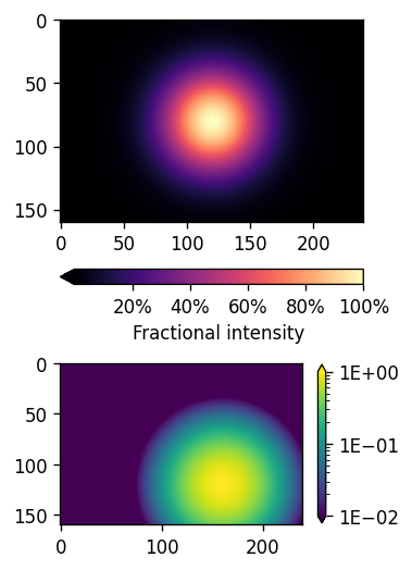
Placing and Formatting Color Bars
Colorbars are methods of Figure, not Axes, in the explicit API. Each axis object must be passed to each colorbar() command explicitly, and the first arg must be a mappable: the plot itself, not the axis object.
If there are multiple subplots, colorbar() takes an ax kwarg to specify which to attach it to, which can be different from the axes that the colors refer to (this can be used to allow the same colorbar to reflect multiple plots with the same coloration).
The extend kwarg lets you indicate that 1 or both ends of the colorbar have been truncated to maintain contrast. There is also a shrink kwarg that helps one resize the colorbar to match a plot’s width or height (depending on orientation), because Matplotlib often makes the colorbar too large by default.
Ticks and locators for color bars are inferred from the plot by default, but can be overriden using the ticks and format kwargs of colorbar().
The
tickskwarg accepts all the same locator functions asax.[x|y]axis.set_[major|minor]_locator()The
formatkwarg accepts the same codes for formatting numbers as the curly braces dostr.format()statements, or a custom formatter function passed toticker.FuncFormatter(). This means you can useformatto force alternative displays of scientific notation, percentages*, etc. (* the normal percentage formatting command doesn’t seem to work for some versions, so you’ll need to use theFuncFormatterapproach).
import numpy as np
import matplotlib.pyplot as plt
%matplotlib inline
#mock up some data
x = np.arange(-3.0, 3.0, 0.025)
y = np.arange(-2.0, 2.0, 0.025)
X, Y = np.meshgrid(x, y)
Z1 = np.exp(-X**2 - Y**2)
Z2 = np.exp(-(X - 1)**2 - (Y - 1)**2)
Z = (Z1 - Z2) * 2
fig, (ax1, ax2) = plt.subplots(nrows=2,
                               figsize=[3,6],
                               dpi=120)
plt.subplots_adjust(hspace=-0.1)
img1 = ax1.imshow(Z1, cmap='magma')
img2 = ax2.imshow(Z2, norm='log', vmin=0.01)
cbar1 = fig.colorbar(img1, ax=ax1, extend='min',orientation='horizontal',
                     format= ticks.FuncFormatter(lambda x, _: f"{x:.0%}"))
# The _ is because FuncFormatter passes in both the label and the position,
# but we don't need the latter. The _ lets us dump the position.
cbar1.set_label('Fractional intensity')
cbar2 = fig.colorbar(img2, ax=ax2, shrink=0.5,
                     extend='both', format="{x:.0E}")
plt.show()
Key Points
Matplotlib is the essential Python data visualization package, with nearly 40 different plot types to choose from depending on the shape of your data and which qualities you want to highlight.
Almost every plot will start by instantiating the figure,
fig(the blank canvas), and 1 or more axes objects,ax, withfig, ax = plt.subplots(*args, **kwargs).Most of the plotting and formatting commands you will use are methods of
Axesobjects, but a few, likecolorbarare methods of theFigure, and some commands are methods both.
Exercise
Exercises and their solutions are provided separately in Jupyter notebooks. You may have to modify the search paths for the associated datafile(s). The data file for the Matplotlib exercises is exoplanets_5250_EarthUnits_fixed.csv, and it should be obvious from the file names which exercises are for Matplotlib.